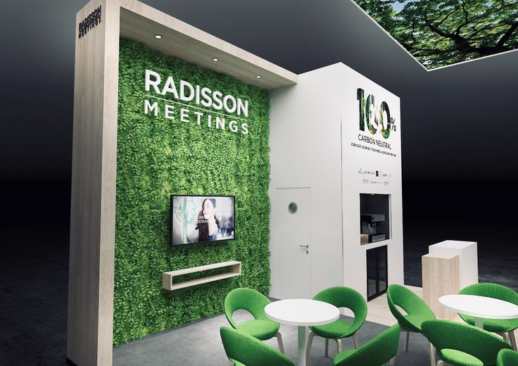
Exhibitions are vital since they allow businesses to interact with their customers face-to-face. One essential element in a show is the graphics. Unfortunately, many exhibitors don’t know how to design exhibit booths to attract more people. They limit themselves to simple brand colors and shapes. It is true that a booth should not be overstuffed and should conform to your brand colors. However, designing a stall that will be outstanding requires incorporating various elements.
Why Your Exhibit Booth Design Matters
Your booth’s design plays a vital role in representing your brand. Before people come to see your services or products, the first thing they will spot is your stall. Therefore, you need to make it as unique and remarkable as possible. You need to leave the job of designing the booth to an experienced stand designer who knows your brand. You must pay attention to various elements when building and creating your stall. These include size, form, space, layout, and font. Therefore, an exhibition booth designer with years of experience has the expertise to direct you to the process, resulting in the ideal booth that meets your exhibit goals and marketing strategies.
The Basics of Exhibition Design Stand Design
Print Material
The advantage of hiring an experienced exhibit booth designer is that they understand the importance of print and how it impacts the final results. The task is generally about deciding which print to use for the exhibition. The material you choose also has an impact on other factors like lighting. For instance, a backlit booth requires a suitable fabric that will not obstruct the brand graphics. You can find this guide to stand materials to help you know how to pick print materials for your exhibition stand. There are various types of materials like fabric, vinyl, and flex. Only an experienced stand designer can discern each material’s advantages and disadvantages. So, gather the necessary knowledge to know the suitable print material.
Layout
Another vital thing is your exhibition stall design layout. The visitors will look at every corner of your booth. Therefore, it is crucial to consider where you will place your brand message and logo. Visitors should be able to distinguish your booth from a distance. So, consider the layout and what they can see at a glance. The purpose of evaluating the structure is to attract the attention of your target audience and explain the brand. Your chosen image or brand statement should tell the guests who you are and how you help them without much effort.
Font
You may be tempted to use fancy and trending fonts on your exhibit booth design. However, if these fonts don’t match your brand, you will miss out on many opportunities. There is a reason people use professional fonts on their booths. The font suggests a tone in the mind of the viewer. It is also good to remember that you choose a font based on your target audience. So, using two fonts on the exhibition stand is advisable to avoid making it look disorderly and unprofessional.
Create the Best Exhibition Stand Design
The information provided here is condensed and should be a glimpse into the various elements of building and designing your exhibition booth. Others, like technology and graphics, also play a vital role in creating the stand. We hope you now understand how to design exhibition stands to help you stand out and attract more people.


