The Chromecast with Google TV was getting better, we’d heard. And since I always like to switch up my streaming style, I was curious how the device was holding up over two years into its life. I tried this last year, so why not try, try again?
The big benefit of testing the best streaming devices is that I’ve got a big box in my apartment where I keep them all when I’m not using them. So, I pulled out the Chromecast with Google TV, ran all the system updates available, and set it up with all of the best streaming services I subscribe to.
And the fact that nearly every app I use on the Apple TV 4K I love was there (with some minor exceptions) made this a very easy process. Especially since (unlike with past Chromecasts), this model has a physical remote.
The good news is that the Chromecast is still great for watching stuff. 99% of the time, I didn’t even think about the device I was using. Only on Paramount Plus, where I saw oddly formated captions during Yellowjackets, did I wonder if things were better on the Apple TV.
That said, I’m going back to the Apple TV 4K — and here’s why.
I’m sorry, but I don’t need recommendations
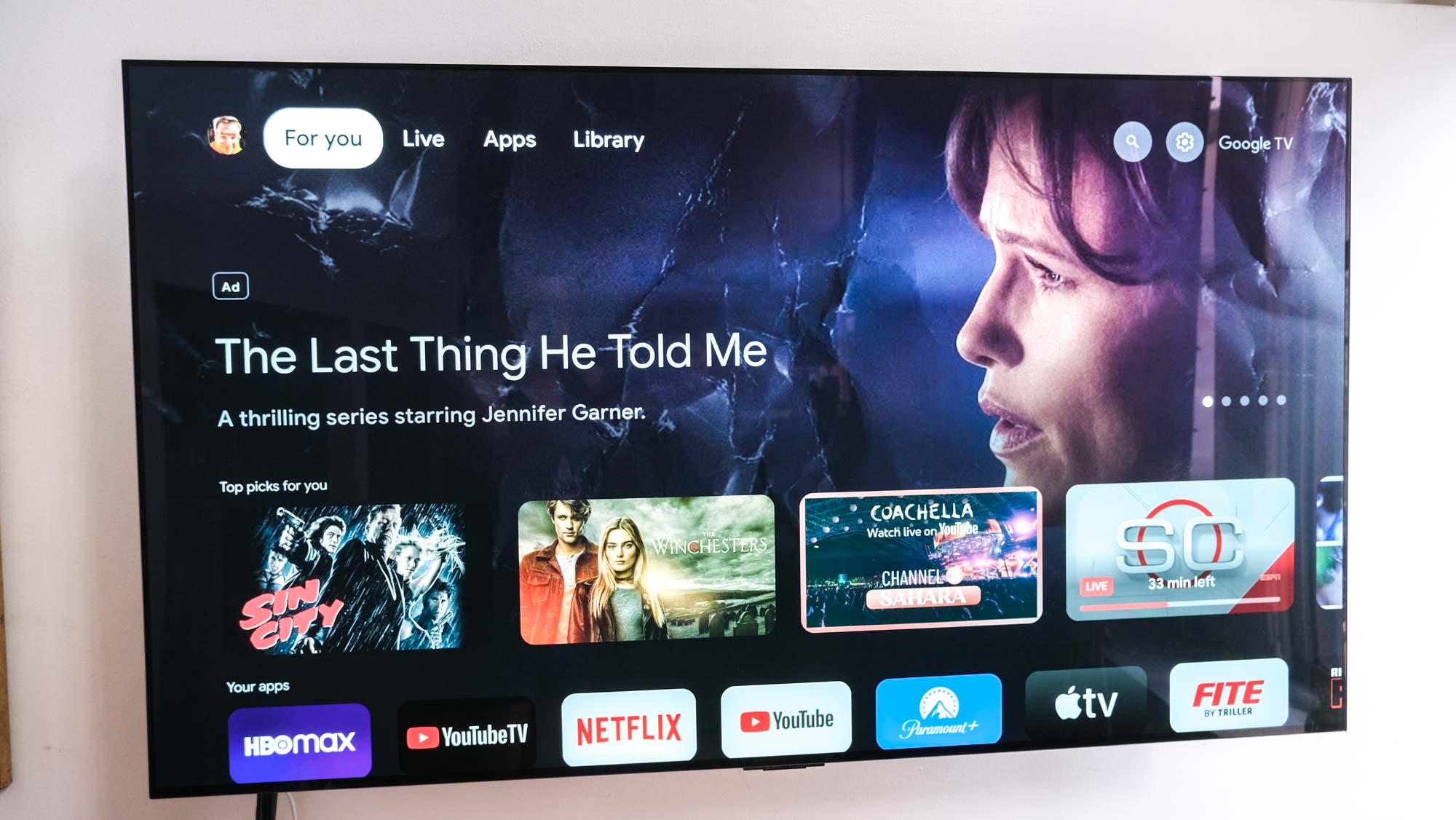
The good news we learned about in February was simple: the Movies and Shows menus from the top of the screen were going away. That made me hope for a less-cluttered experience. But my big problem with the Chromecast with Google TV from before had remained: I still find its interface to be a bit congested. And while home screens aren’t the be-all, end-all, they’re the primary way we start to watch things.
The first hiccup was almost the worst: Brendan Fraser’s The Whale was nearly tattooed to the home screen for the better part of a week in March. As someone who walked out of this movie (in theaters) after 40 minutes? This was too much. Yes, this was Oscars season, I get it. It’s not as bad as what you see on the Fire TV, but it’s a far cry from the tidy and spartan Apple TV 4K interface.
Then, I tried to help the Chromecast TV find me better shows, by giving feedback through its recommendations row. In that “Top picks for you” section, you can long-press on show or movie’s icon to bring up a menu, where you can click Watched it, Watchlist It, Like or Dislike.
The more I ran into main “slideshow” image recommendations and “Top picks for me” that did nothing for me? The more the Chromecast felt like work.
The most irksome thing here, beyond the recommendations (I might like superhero movies, but nobody needs to watch 2015’s Fantastic Four) was that clicking Dislike didn’t immediately discard the recommendation and replace it. And the more I ran into main “slideshow” image recommendations and “Top picks for me” that did nothing for me? The more the Chromecast felt like work.
On occasion, they nailed it, like a Barry promo splashed on the home page, or when Spider-Man 2 made it into the Top picks section. The only problem is I’d already watched Barry season 4’s screeners, and I’d just rewatched Spider-Man 2 too recently.
I’m an apps-first streamer
Not a huge amount of work, but a repeated two clicks down when I booted up the device to get to the section I want: my apps. Maybe this is my fault. Maybe I should just get used to living the Google Assistant life and use the remote to speak to summon apps. But I’m traditional.
On the Chromecast, that means I have to click three times to get to the apps, and then scroll though a single horizontal row of apps. And if the app isn’t at the front of the line, that’s click, click, click and more clicks.
I will admit that the Apple TV 4K spoiled me
This may not be a big deal for those of you with only a select group of apps you like. But I’ve got more than 12 installed, and I found myself clicking all the way to the right sometimes to see the dozen that don’t show up on the home screen.
The thing that confuses the heck out of me is that this row of application icons doesn’t rearrange based on what you’ve used most recently.
The Chromecast isn’t as fast as I’m used to
The above user experience probably wouldn’t stand out so much to me were it not for the fact that the Chromecast with Google TV’s interface is kind of sluggish. Not to an unusable point, mind you: there’s just a delay or two that you’ll notice if you’re used to pricier devices.
When you feel like you’re waiting for your tech to catch up to you that’s no fun.
I will admit that the Apple TV 4K spoiled me when it comes to user experience. And that better be the case when Apple’s $129 4K box costs 160% more than the $49 Chromecast with Google TV does.
But when you feel like you’re waiting for your tech to catch up to you? That’s no fun. I know the Roku Streaming Stick 4K isn’t the speediest stick on Earth, but it probably feels a little faster since it doesn’t have an image-rich interface like the aforementioned Chromecast with Google TV home screen.
I like how the Chromecast gets live TV right
The last time I switched to the Chromecast, I didn’t stick in part because the live TV screen was notably not enough. Now, though, I want to give Google credit for nailing the integration with live TV. You’ll see tiles for live TV on the Picks for you row, and there’s a top-of-screen live tab that integrates with YouTube TV, Sling TV and Philo.
I switched to YouTube TV earlier this year, and found the Live section to be an easier way to open a show that’s live and in progress. Now, you can switch between the full guide and your favorites, a pleasant change.
I’d probably love this more were I still on Sling TV, as its interface is not as fun to use as YouTube TV’s. Comparatively, Roku doesn’t play in the live paid-TV space like this, neither does Apple. Fire TV offers something similar, but the Fire TV platform is even less for-me than Google’s.
Outlook: Apple TV still beats Chromecast
I think, unfortunately, that the Chromecast with Google TV is wasted on me. The only time I wanted to “cast”-stream something to my TV, it was because one of my apps (IWTV, the Independent Wrestling TV streaming service) didn’t have an app on Google TV. The other apps that weren’t there are for watching TV screeners for reviews.
I’m sure there are plenty of people out there who want the ability to ‘cast’ to their TV. And I bet there are people who like to get the recommendations on their screens. I’m just ready to accept I’m not one of them.


