On the launch of the Aston Martin DBX 707 in 2022, a heavily overhauled version of the DBX, we were given the obligatory show-around of the car. All was going well until we got inside and prodded the screen on the dashboard. “Yeah… that’s still not a touchscreen,” came the awkward reply.
However spectacular Aston Martins look, sound and perform, nothing screams ‘old tech’ these days more than a large display screen in the middle of a dashboard that you can’t operate by touch (whether touchscreens are a good thing is another debate, but you get what I mean…). On a car launched in 2022, as the DBX 707 was, and built by a car maker positioning itself at the very top of the industry, it wasn’t really good enough, however fantastic the rest of the car was.
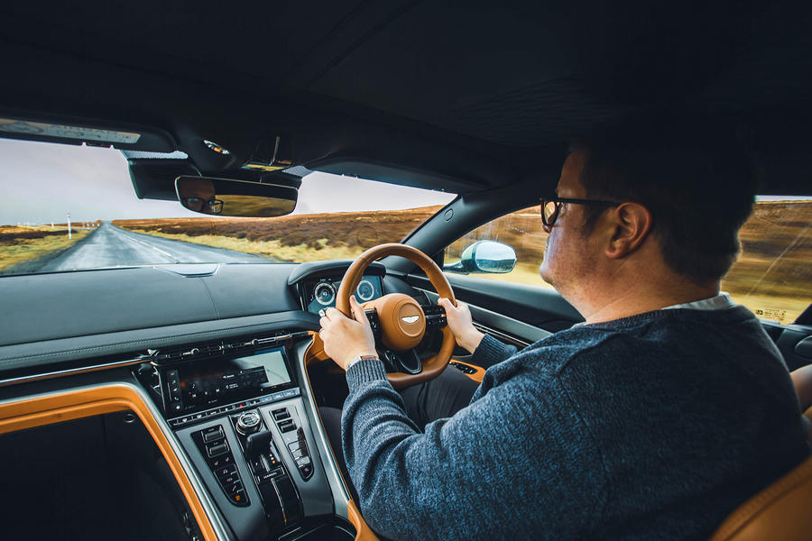
Thankfully, the Aston Martin DB12 does have a touchscreen. The software it runs is not perfect, the fonts are a bit small, and some of the menus are too well hidden. But of much bigger significance is the fact that the screen exists at all; that you can prod it with your fingers; and that the software is all of Aston’s own design rather than being a Mercedes hand-me-down.
You can tell this is Aston’s first proper go at designing its own modern touchscreen interface, because it’s working through a few beginners’ mistakes. Some of the menu icons are too small to easily hit with an outstretched arm, for instance. There’s no physical cursor controller either on wheel or centre console, so no option but to reach for those fiddly icons; the software’s a bit glitchy and vulnerable to crashing; and the navigation is missing a couple of display modes. Oh, and the screen as a whole gets quite hot when it’s been on for an hour or so – which makes holding your fingertip to it, to move the map around or scroll down on a menu, a little unpleasant.
Still, all are things that can be fixed with updated software (what an old chestnut that’s becoming), and this wouldn’t feel like a new Aston Martin if it hadn’t been launched with some ‘areas for improvement’.
After a day of familiarity, not all of the controls were falling easily to hand. But credit to Aston for not putting every control on the touchscreen. This has the feel of a first-generation layout in the way physical and digital controls mix. Further usability refinements are to come, though, with seven more front-engined sports cars, including derivatives, to follow the DB12 over the next two years.
The cabin’s other main area of progress, meanwhile, is undoubtedly its material quality, which is now on a par with Bentley’s in places and well beyond that of a Ferrari. There’s a chunky engine start button, with a rotating collar around it for juggling driving modes, which both feel expensive to the touch – as do the knurled-metal roller toggles for heater temperature and audio volume control. There’s now in places the look and feel of a high-end, military-chic watch about the DB12’s cabin.
There’s plenty of room in the car, decent storage and usable occasional back seats. The DB12 isn’t quite as large as some two-plus-two luxury coupés, nor is its cabin quite as roomy – although there’s plenty of room up front, so you don’t feel too intimately acquainted with your passenger and you don’t bang elbows across the centre console, while kids of up to about the age of 12 could comfortably travel in the back seats.


